



Create
Design and configure the survey.
2015–2016 · SaaS / Survey Platform
Unifying a web & mobile platform for creating, distributing and analyzing surveys.
Suonper was a multi-channel platform for creating surveys, collecting responses through the web and mobile devices —including offline fieldwork— and analyzing results from a central platform.
I redesigned and reimplemented the web experience as a responsive interface, carrying the visual and interaction language that was taking shape in the iPad app across the rest of the product.
Suonper covered a full cycle: design the survey, choose how to distribute it, collect responses —including offline—, sync them, and analyze results from a single product.
Dashboard
Control center for the survey lifecycle
Create
Design and configure the survey.
Launch
Choose how to distribute it.
Collect
Collect responses across multiple channels.
Sync
Sync information collected offline.
Analyze
Results, segmentation, geography and participation.
A capable product, fragmented across many surfaces.
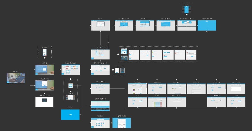
When I joined, Suonper was no longer a form builder: it was a wide, branched system. The historical flow map documents that full architecture —before the redesign— with four areas that already coexisted in the product.
Manage
Dashboard, participants and statuses: the control center you returned to after creating, launching or analyzing.
Create
New → Welcome → Required data → Questions → Panel → Preview.
Launch
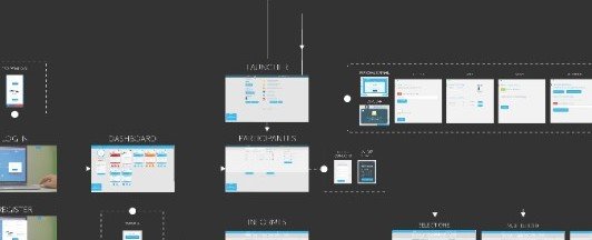
The Launcher connected the survey to mail, mobile, Facebook, Twitter, blog and other channels.
Analyze
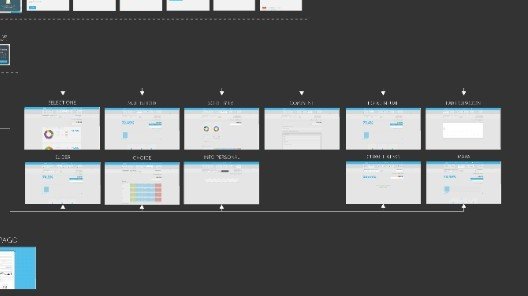
Reports and different results by question type: from summaries and scales to maps and open answers.
Detail from the historical map
Create

Launcher
Reports
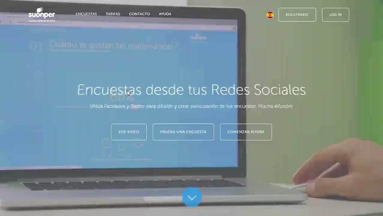
The web layer belonged to an earlier stage of the product. This capture shows the public homepage of that moment —a long landing, with several messages competing—; it is not Dashboard or Create.
At the same time, the more recent iPad app was already starting to define a different visual and interaction direction. The work was not to change how the web looked: it was to bring those surfaces closer together and build a coherent experience as the platform grew.
[ SUONPER — IPAD DIRECTION ]
asset pending
iPad direction
Captura de la aplicación iPad que sirvió de referencia visual.
01
Complex legacy system
02
Fragmented visual experience
03
iPad as emerging direction
04
Unified responsive product
The proto-personas were built from internal knowledge accumulated by the team. They were not personas resulting from formal interviews.
Main clients
Explored segments Potential segments such as independent professionals were also explored.
Victoria Gianone
Human Resources
HR consultancy
Andrés Ricciardi
Freelance designer
Independent professional
María Daniela
Communications Director
Organization / consultancy
Home
Registration
Too much friction before entering the product.
Dashboard
Too many elements competed for attention.
New Survey
Creation could feel like a long process.
Launcher
It was not always clear how to activate the survey and get the link.
The iPad app was an important reference for the redesign.
The work was to translate that direction into a responsive web experience and progressively extend visual and interaction patterns across the rest of the platform.
Shared product language
iPad
[ SUONPER — IPAD DIRECTION ]
asset pending
iPad direction
Captura de la aplicación iPad que sirvió de referencia visual.
Responsive web
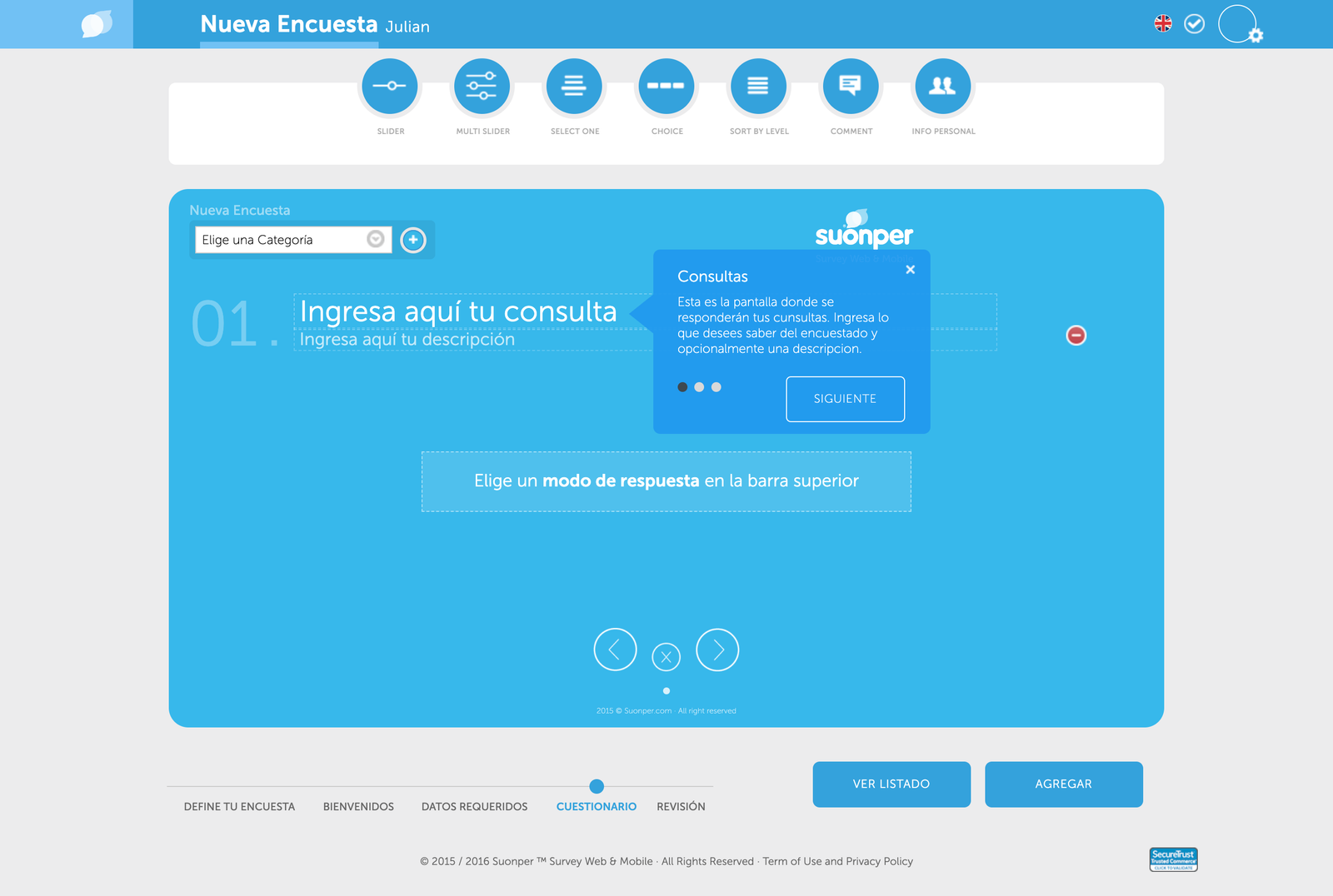
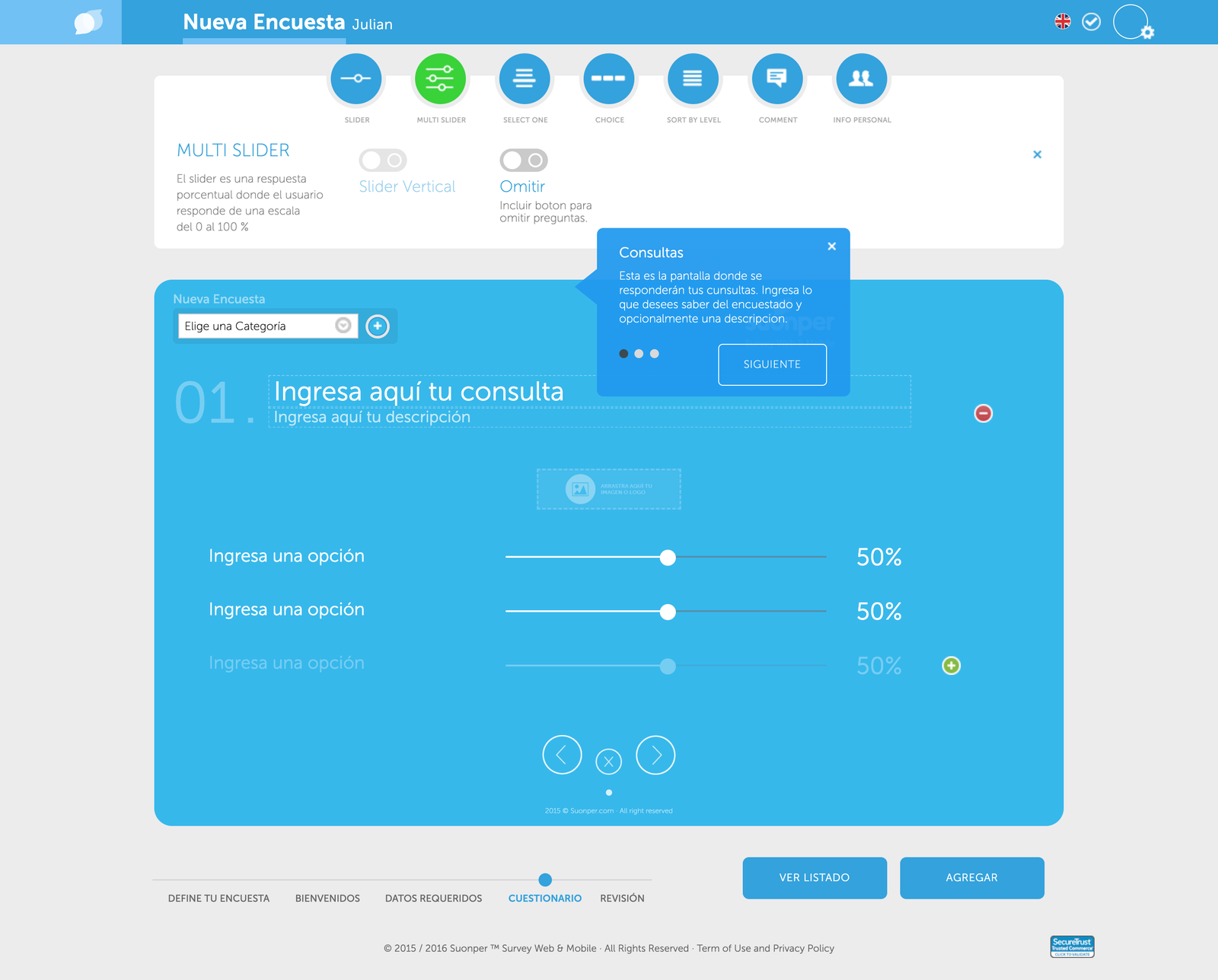
Creating a survey meant combining question types, configuration, required information and presentation decisions.
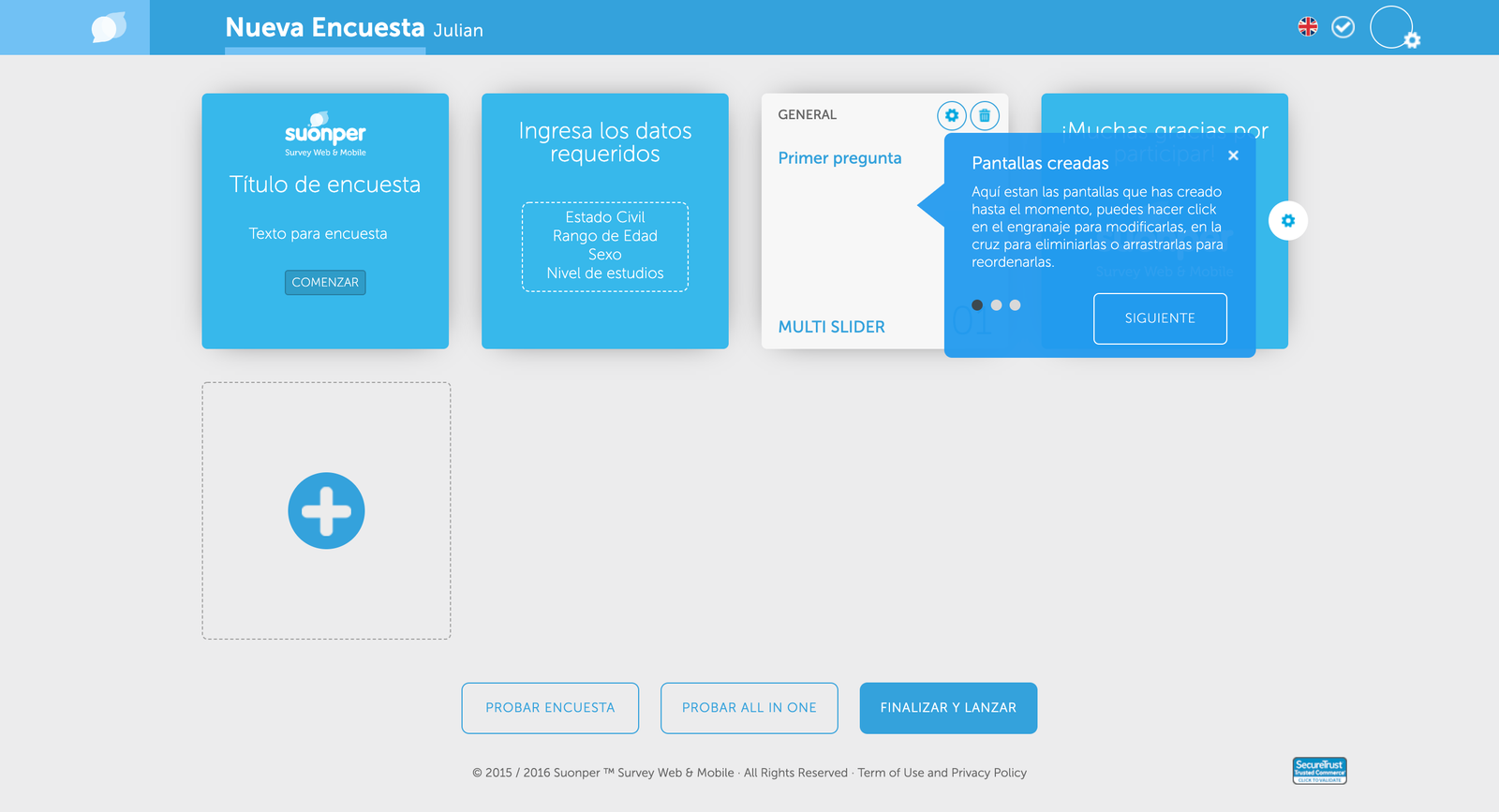
Instead of exposing every option at once, the experience was organized as an explicit sequence of stages.
Available configuration also changed according to the selected question type.
Define
Welcome
Required data
Questionnaire
Review
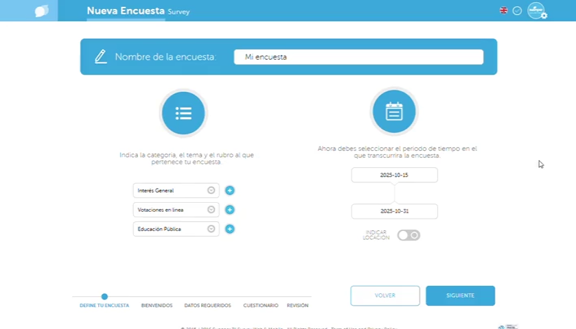
[ SUONPER — CREATE — BIENVENIDOS ]
asset pending
Create — Bienvenidos
Paso WELCOME / pantalla de bienvenida de la encuesta.
[ SUONPER — CREATE — DATOS REQUERIDOS ]
asset pending
Create — Datos requeridos
Paso REQUIRED DATA / configuración de datos del encuestado.
Building the questionnaire was only one part of the process.
The Launcher connected the survey with the different channels available to collect responses.
The Launcher showed up as one of the main friction points because it was not always clear how to enable a survey or recover the link to share it.
Survey
Launcher
[ SUONPER — LAUNCHER ]
asset pending
Launcher
Pantalla histórica de publicación y canales.
The Dashboard brought together the surveys created by the user, their status, and access to the next actions in the cycle.
It was the product’s return point: from there you could create a new survey, keep working on an existing one, launch it, or open its results.
The product model, taught inside the interface
Visit your dashboard
Create a survey
Choose how to launch it
See the reports
[ SUONPER — DASHBOARD ]
asset pending
Dashboard
Dashboard con encuestas, estados y onboarding del ciclo del producto.
Reporting was read in layers. Global filters narrowed the set; the overview showed the overall state; from there you could drop into categories, individual questions and profile segmentation.
Global filters
Overview
Category
Question
Segmentation
Global filters
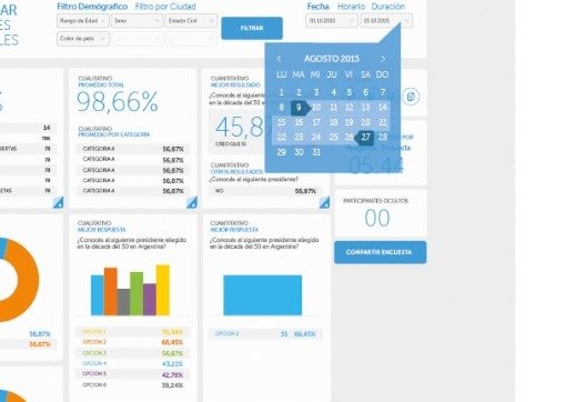
Demographics, city, date, time and duration defined the cut before any chart was read. The datepicker let you choose a range.
Overview
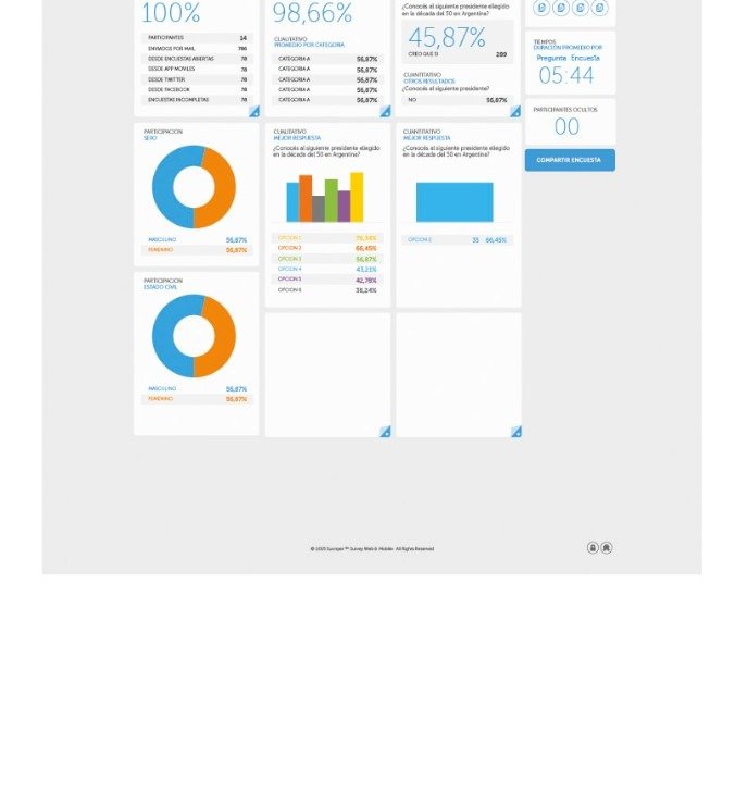
The General Reports Dashboard brought together participation, qualitative and quantitative summaries in a single board.
Category
Qualitative reports aggregated results by category, with bars comparing the set.

Question
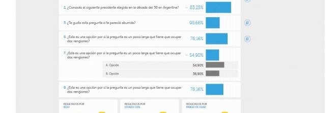
Each question could be opened to see its options. The visual treatment changed between the total and the detail.
Segmentation
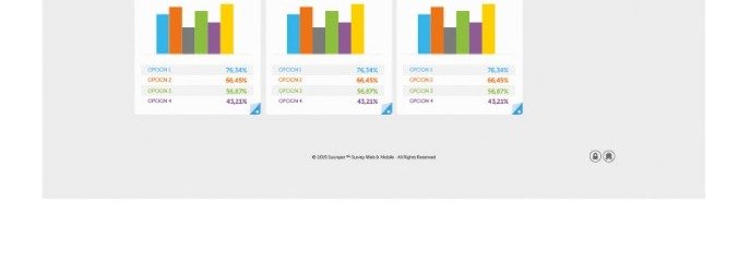
The same results were crossed by sex, marital status and age range.
The work did not stop at producing screens.
I worked alongside the development team as the product evolved: iterating existing workflows, defining new functionality, and implementing a substantial part of the responsive interface.
Public-facing experience
The redesign did not end inside the application. We also rebuilt Suonper’s public presence so it explained the product with the same logic with which it was used.
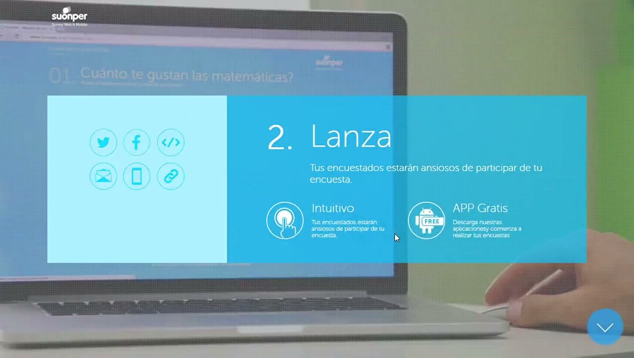
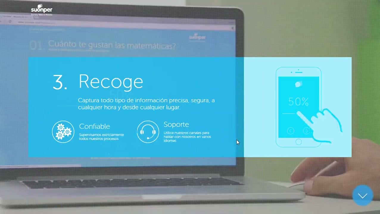
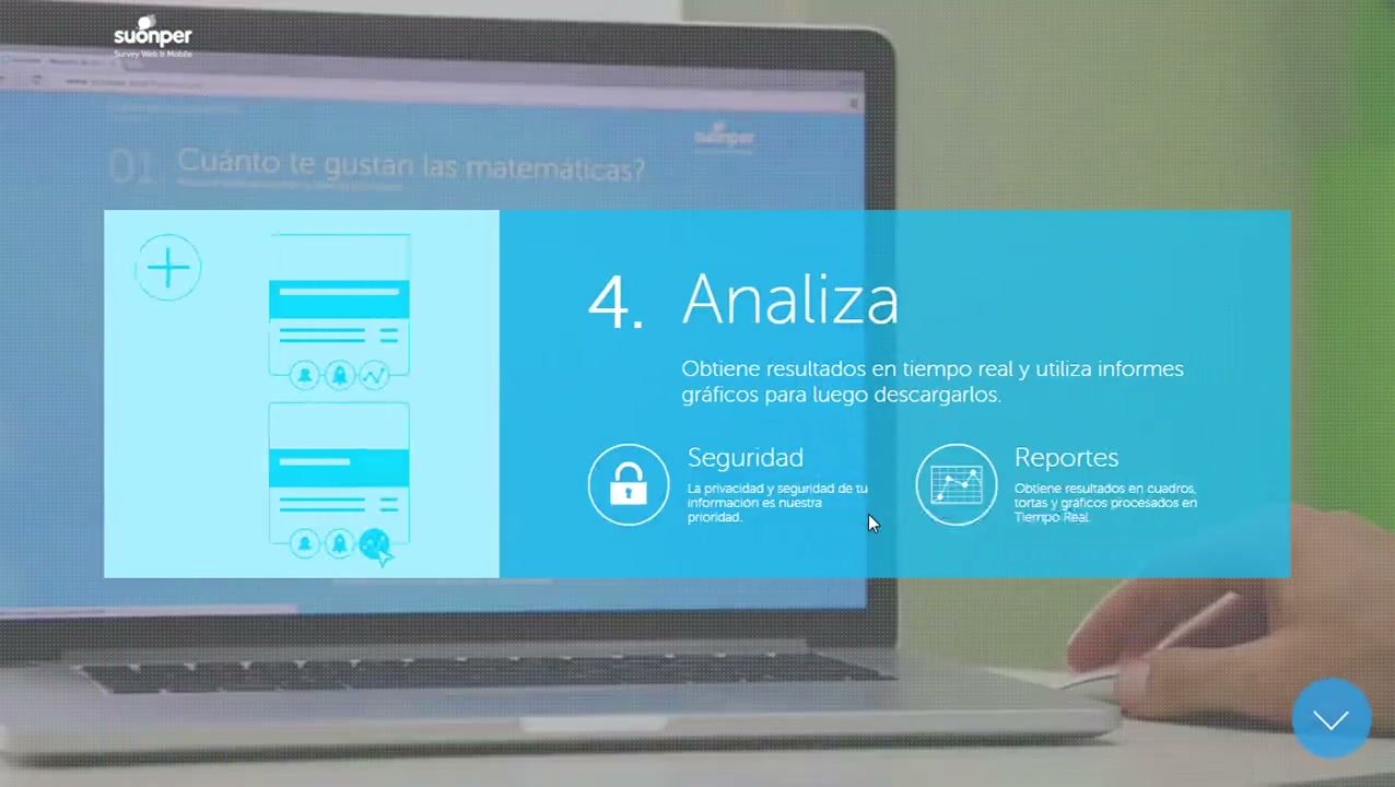
The previous website presented many capabilities in a relatively independent way. The new version simplified that story around four moments: create, launch, collect and analyze.
Marketing and product began to share the same mental model.
Before
A long landing page, with multiple features and messages competing for attention.
After
A product story organized around the main flow.
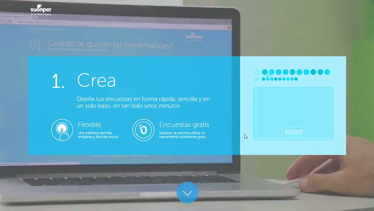
Outward-facing: Create → Launch → Collect → Analyze. Inside the product: Manage → Create → Launch → Analyze.
CREATE
Design the survey.
LAUNCH
Choose how to distribute it.
COLLECT
Collect responses on web, mobile and offline.
ANALYZE
Turn responses into information.
Discoverability is contextual
At the time I was starting to understand that a capability should not exist only as a navigation option. Showing “update plan” next to usage or account information could make much more sense than only having “Pricing” in the main menu.
Visual simplicity ≠ cognitive simplicity
At that stage we had a strong iOS influence and assumed that replacing actions with icons simplified the interface. I would approach it differently today: reducing visual elements does not necessarily reduce ambiguity or cognitive load.
Suonper was one of the projects where I started thinking of an interface as a system rather than a collection of screens.
The work connected creation, distribution, management and analysis through a responsive web experience and a more coherent language between web and mobile. That same model then extended to the product’s public presence, aligning the experience of use with the way Suonper was explained to the outside.
Next project
Discoin
Designing a digital rewards and payments wallet for local commerce.