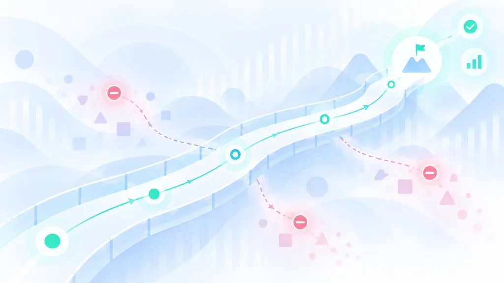
UX guardrails: what they are and how to design limits without breaking the experience
A product should not allow everything it is technically able to do.
A transfer may require confirmation. A system may prevent critical information from being deleted without a recovery path. An assistant with artificial intelligence may draft a reply without sending it until someone approves. A recommendation can be shown, while a sensitive decision still needs a person.
Those limits can be thought of as guardrails: deliberate constraints that protect what a product should not sacrifice, even when it is trying to become faster, more flexible, or more autonomous.
The term shows up more and more around artificial intelligence, but the problem is not new. Designing products has always meant deciding not only what a person can do, but also what the system should block, delay, confirm, or recover.
That is where guardrails become a UX problem as well.
What a guardrail is
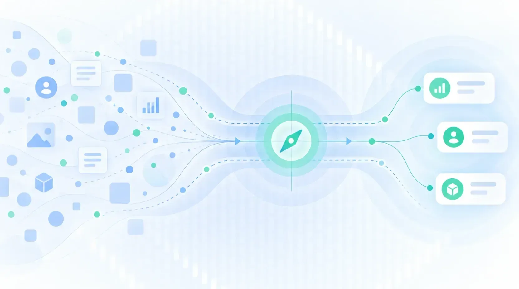
A guardrail is a limit defined deliberately to prevent certain states, actions, or consequences.
It does not necessarily live in the interface.
It can be implemented through permissions, business rules, technical constraints, validations, operational limits, human review, or mechanisms that control which actions a system can execute.
The interface is only one part of that mechanism.
For example, an assistant might display a message saying:
“Check before performing sensitive operations.”
That is an instruction.
If the system actually requires approval before executing that operation, there is also an effective control.
This distinction matters especially in AI products: asking a model to behave a certain way does not guarantee that the limit will hold.
A guardrail should exist at the appropriate level of the system.
Not every restriction is a guardrail
Digital products are full of restrictions.
A required field, a character limit, or a disabled button can help someone complete a task correctly without being a guardrail.
The difference is what we are protecting.
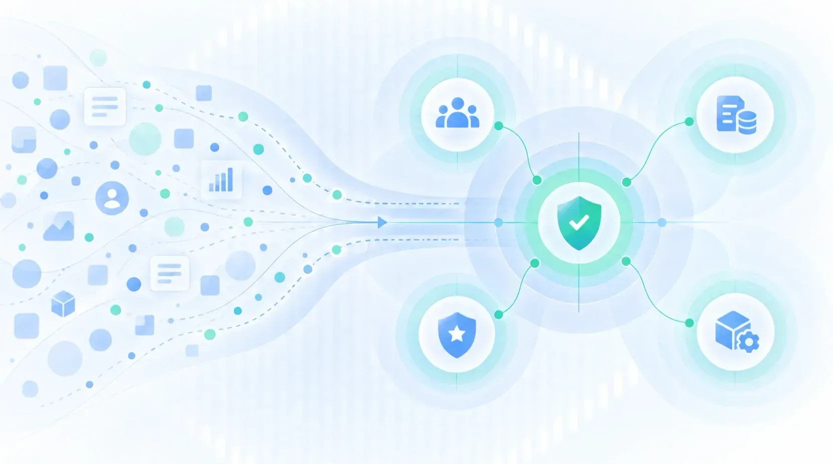
A guardrail appears when there is something the system treats as important enough to limit degrees of freedom.
For example:
Deleting information
Recoverability
Publishing content
User control
Accessing sensitive information
Privacy
Running a critical operation
Safety
An AI acting with tools
Human control
An AI cannot resolve a task
Continuity
The goal is not to add obstacles.
It is to reduce the chance that an interaction ends in a state that is difficult, costly, or impossible to repair.
Why guardrails are also UX
A technical team can decide that a given action is forbidden.
Sooner or later, though, a person will run into that limit.
And at that moment, experience questions appear:
- Why can’t I do this?
- What happened?
- Did I do something wrong?
- Is there another way to continue?
- Can I change this decision?
- Who has control now?
UX is precisely that translation between system constraints and people’s experience.
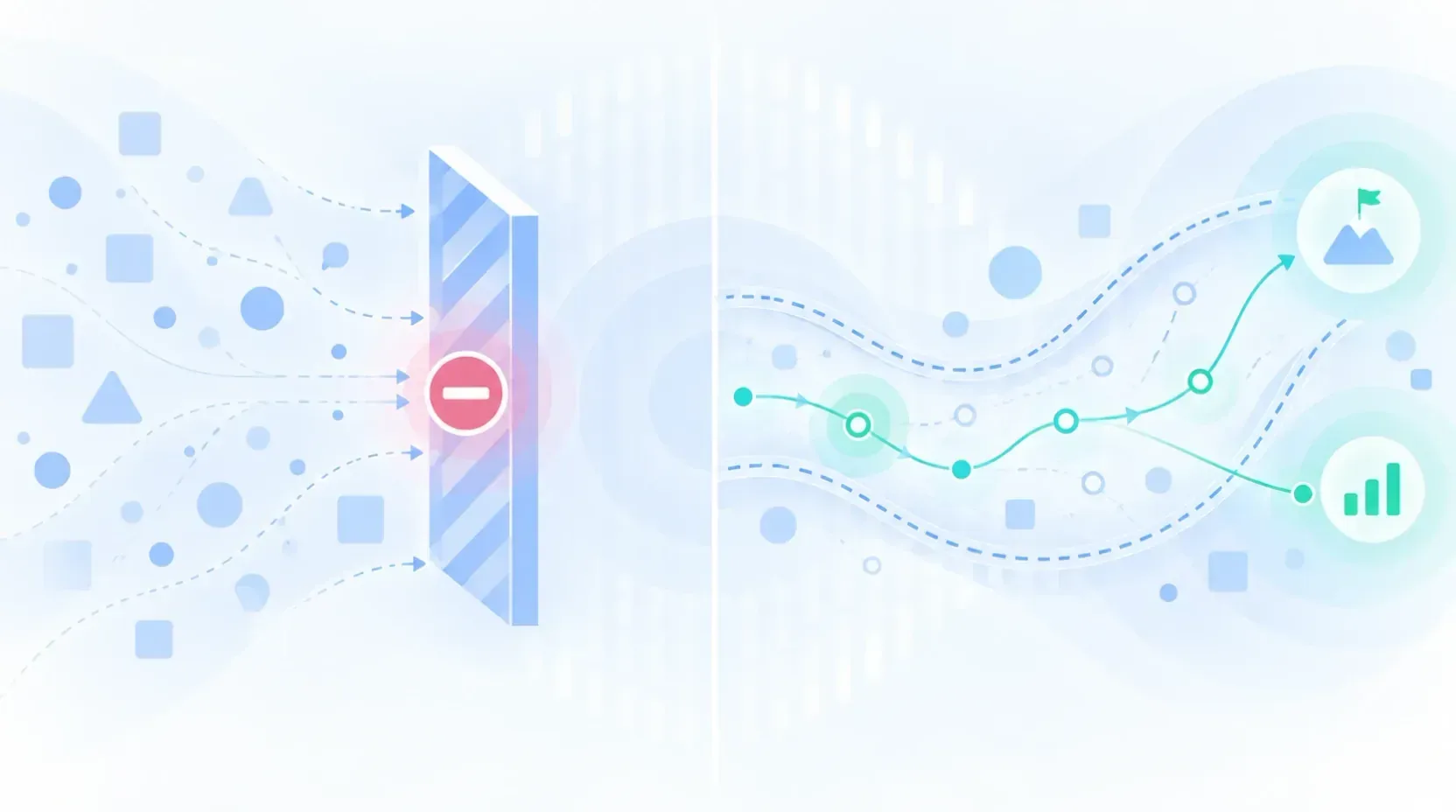
A technically correct guardrail can still produce a terrible experience if it shows up as an arbitrary barrier.
“Action not allowed.”
“Error.”
“We cannot complete this request.”
The system may have avoided the risk, but it left the person with no understanding of what happened.
A good guardrail does not only block when it must. It makes the limit understandable and keeps, whenever possible, a path forward.
Design the limit, not only the error message
One of the most common mistakes is to bring UX in after the decision has already been made.
First a restriction is implemented, and then someone asks:
“What copy do we put when this fails?”
Designing guardrails starts earlier.
We have to decide:
What we want to prevent
Not “that the AI fails,” but something observable: sending private information, executing an action without authorization, presenting an uncertain claim as a fact, or blocking a legitimate task without need.
How much risk that action carries
Not every action needs the same amount of friction.
Exploring a recommendation and performing an irreversible operation should not be treated as the same thing.
Where the limit should apply
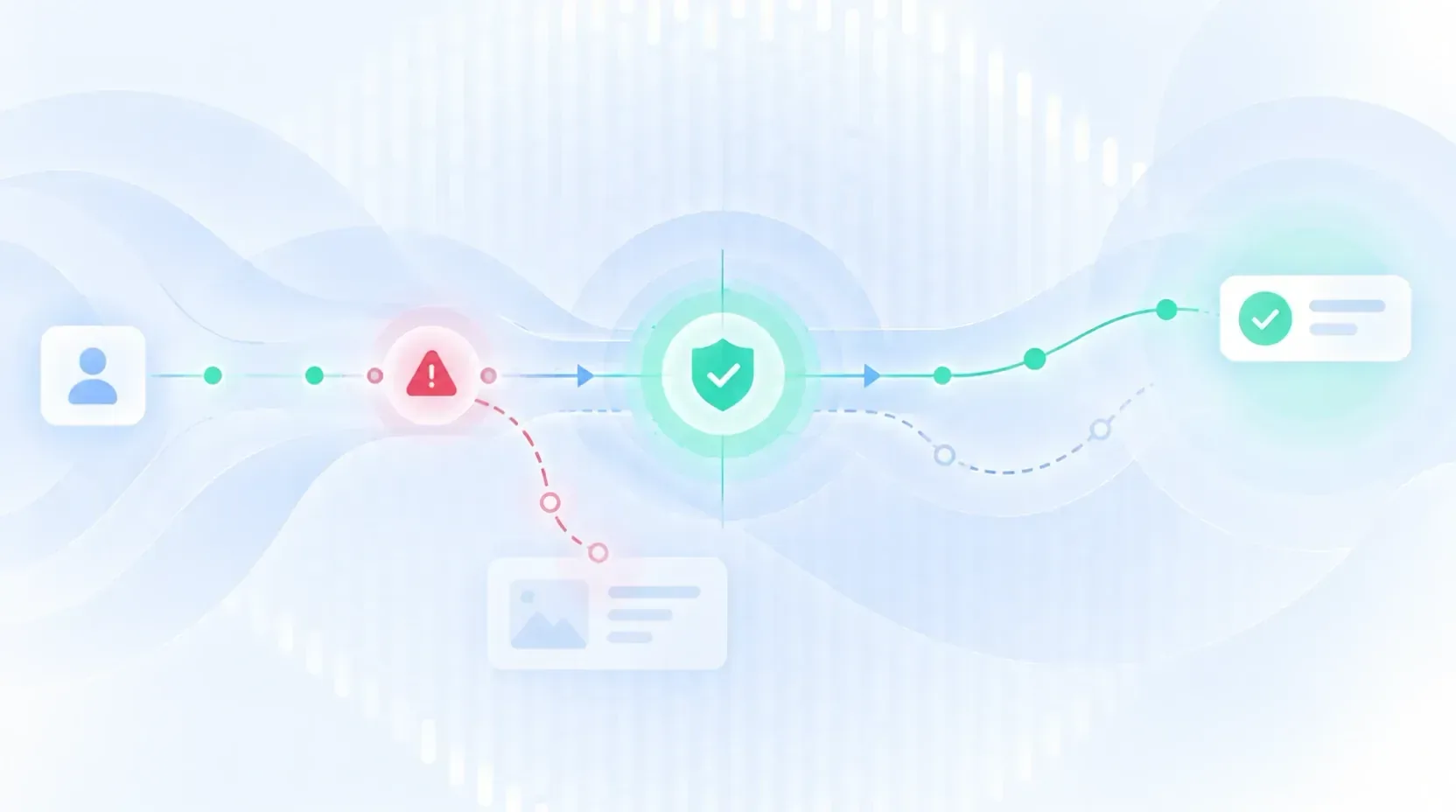
It can exist before an action starts, while it is running, or before a result is shown or confirmed.
What happens when the guardrail fires
Blocking is only one option. We can also ask for confirmation, reduce capabilities, request more information, hand off to another person, or allow a correction.
How the person can recover
A limit without recovery easily becomes a dead end.
Friction can be part of the design
UX is not about removing all friction.
It is about understanding which friction adds value and which does not.
Confirming every trivial action makes the product slow and annoying.
But asking for confirmation before an action that is hard to reverse can be exactly the right experience.
The problem is not the absolute number of steps.
The problem is the relationship between the friction introduced and the consequences it is trying to prevent.
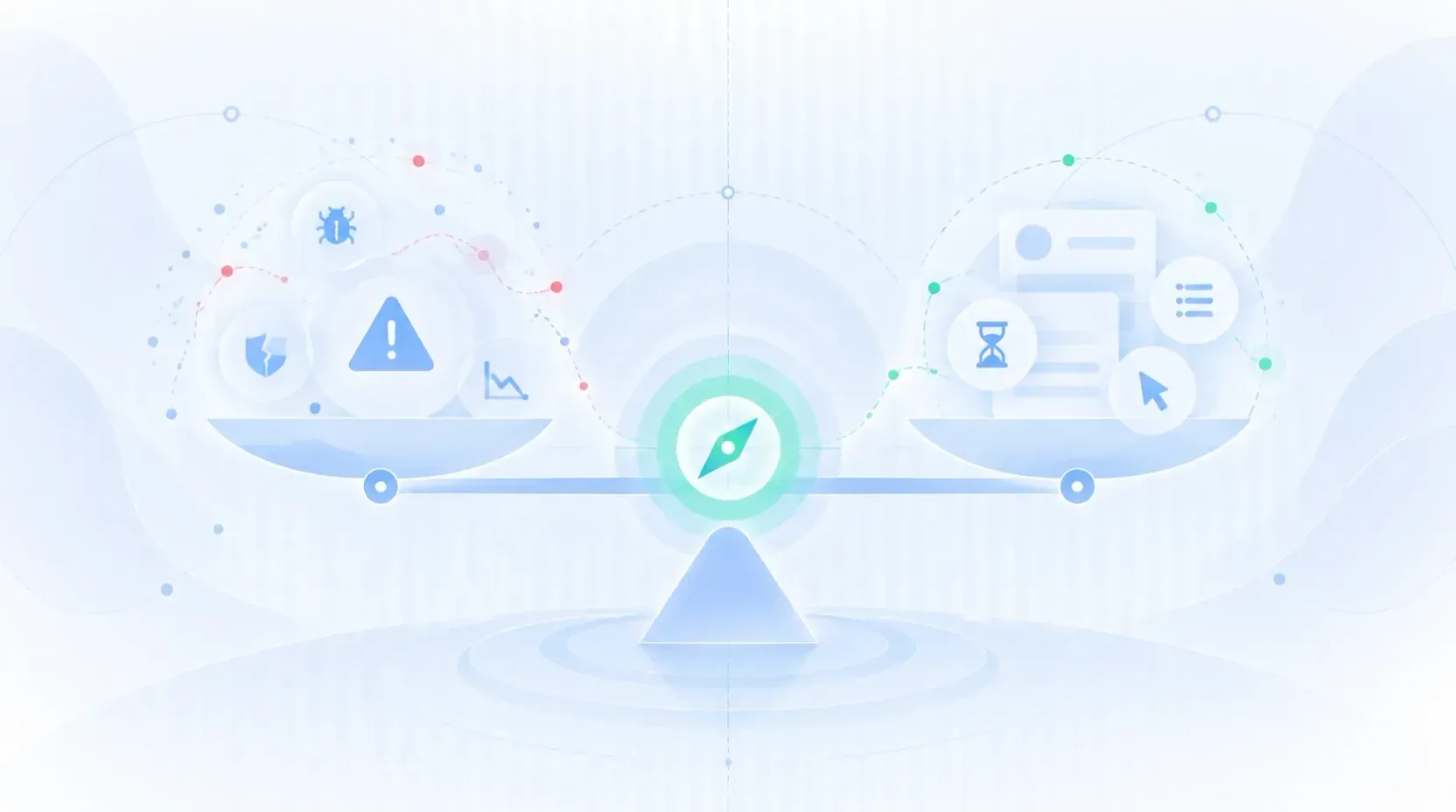
We can think of the guardrail as a proportional decision:
low impact → little intervention
high impact → more control
That is why a good experience does not try to make every flow equally fluid.
Some parts should be fast.
Others should deliberately make us stop.
What changes with artificial intelligence
Traditional systems usually operate inside relatively defined states.
Generative systems introduce more uncertainty.
They can produce different answers in similar situations, misread an intention, or use tools to take actions the designer never specified screen by screen.
That makes boundaries much more important.
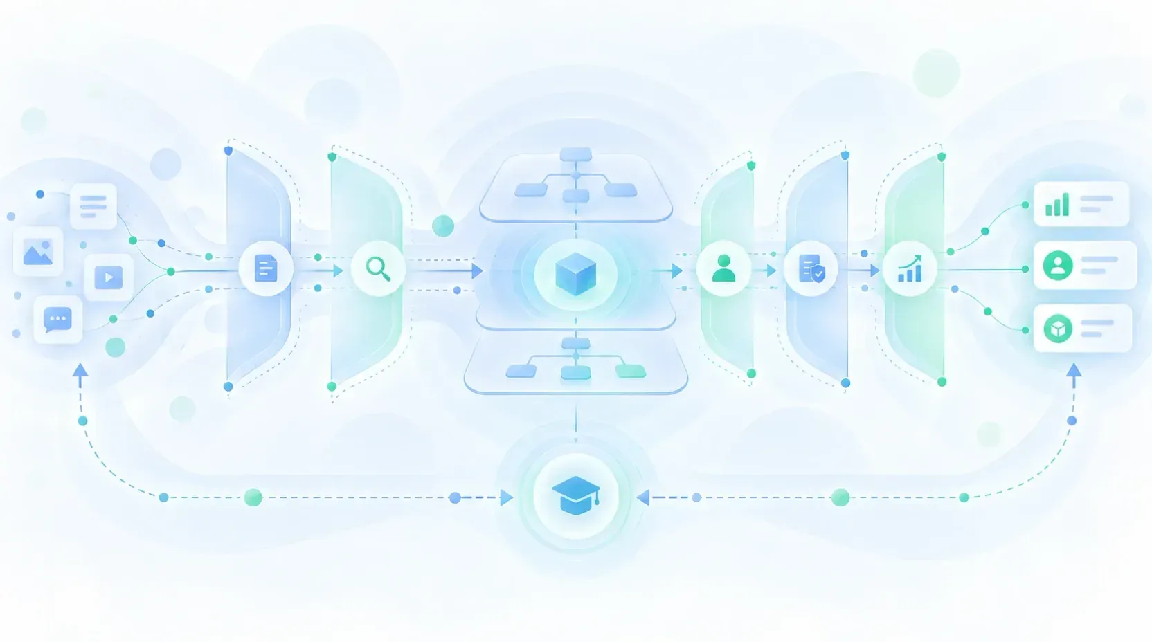
In AI products we can find guardrails at different levels.
Before acting
The system determines what information it can receive, which sources it can query, or which tools it has available.
From UX we can communicate that scope before creating the wrong expectations.
While acting
Some operations may need confirmation, extra permissions, or review.
The person should be able to understand what is about to happen before losing control of the action.
After producing a result
The output can be verified, classified, or sent to review before it is used.
UX can help by showing sources, allowing the result to be edited, or clearly separating a proposal from an action that has already been executed.
When the system cannot continue
This point usually gets less attention.
A responsible system does not only need to know when to stop.
It needs to know how to hand control back.
The limit, then, should not feel like the end of the product.
It should become another state of the interaction.
An example: an assistant that can take actions
Suppose a customer-support assistant can look up orders, change information, and handle requests.
We could give it full access and trust that it will interpret every conversation correctly.
Or we could design different levels of autonomy.
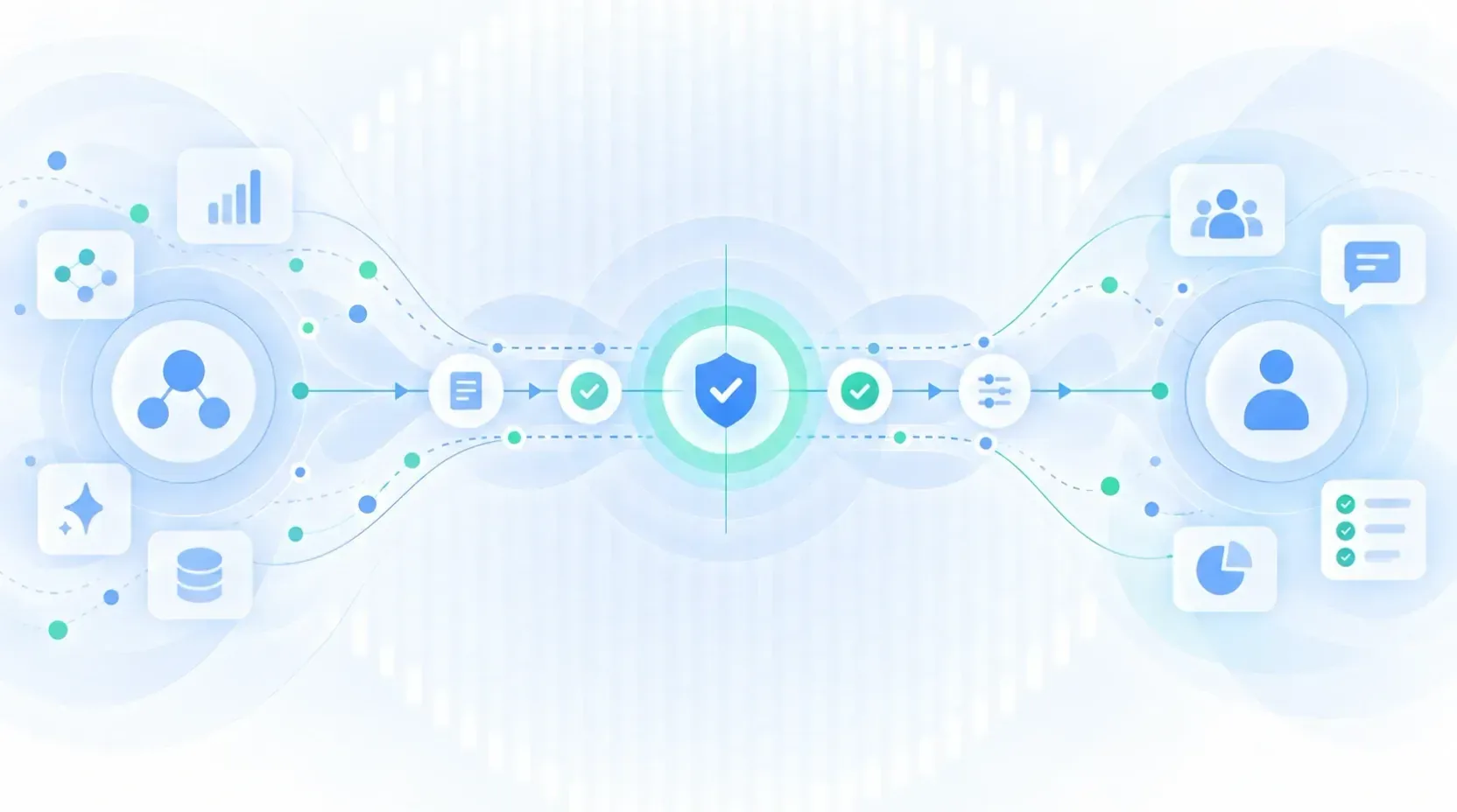
Looking up an order can be automatic.
Preparing a change can be allowed, but require the user to review it.
A sensitive operation may need extra authorization.
A situation the system does not understand can be transferred to a person.
The guardrail is not only the confirmation screen.
It is the set formed by:
- the available capability,
- the permission,
- the moment of confirmation,
- the information shown,
- the recovery mechanism,
- and the alternative path when the system cannot continue.
The experience emerges from that whole system.

When guardrails are poorly designed
Adding more limits does not automatically produce a safer product.
A guardrail can also fail by excess.
If it continually blocks legitimate actions, people start looking for ways around it.
If it shows warnings constantly, they stop drawing attention.
If it demands confirmation for everything, confirming becomes an automatic gesture.
If it never explains why it intervened, the system feels unpredictable.
And if it always escalates every doubtful situation, the supposed automation loses its usefulness.
That is why guardrails also need research and evaluation.
It is not enough to ask:
Did the limit prevent the behavior we wanted to prevent?
We also need to know:
- How many legitimate tasks did it block?
- Did people understand what happened?
- Were they able to continue?
- Did they try to work around the mechanism?
- Did it increase or reduce their trust in the product?
A barrier that protects the system but makes the product unusable is not working correctly.

Guardrails and user control
There is a principle behind many good guardrails: keep a clear distribution of control between the person and the system.
The greater a product’s capacity to act autonomously, the more important it becomes to design that relationship.
The user should be able to tell:
- what the system is proposing,
- what it is executing,
- what needs approval,
- what can be undone,
- what is out of reach,
- and when another person steps in.
This is not about making every technical decision visible.
It is about making important consequences understandable.
An interface can hide complexity without hiding control.
Guardrails as metrics
The term guardrail also appears in product experimentation.
In that context it does not describe a restriction on an action, but a metric that establishes which outcome we are not willing to degrade while we optimize another.
We might try to improve conversion, for example, while also watching errors, cancellations, complaints, or some other critical variable.
The underlying logic is the same.
Optimizing one dimension should not let us ignore all the others.
This meaning is related to the use of guardrails in AI and product design, although it is worth distinguishing the two contexts.

Designing freedom requires designing limits
For a long time UX talked mainly about possibilities:
what a person can do,
which path they can follow,
which features they need,
how easy it is to complete a task.
More autonomous products add another question:
What should the system not be able to do, even when it technically can?
That limit is not only a legal, technical, or security decision.
It has direct consequences for expectations, trust, autonomy, recovery, and control.
That is why designing guardrails is also designing experience.
A good guardrail can go almost unnoticed when everything works.
But when a problem appears, it should do something much more valuable than simply stopping it:
help the person understand what happened, keep control, and find a safe way to continue.
Sources
- Amershi, S. et al. Guidelines for Human-AI Interaction. CHI 2019.
- Microsoft. Guidelines for Human-AI Interaction.
- NIST. Artificial Intelligence Risk Management Framework (AI RMF).
- OpenAI. A Practical Guide to Building Agents.
- Kohavi, R., Tang, D., and Xu, Y. Trustworthy Online Controlled Experiments.